Fenco (UI/UX Design)
Industry ®
FinTech App
Scope of work
UI/UX Design
Timeline
Sep 15th – Nov 15th
Ideation & Conceptual
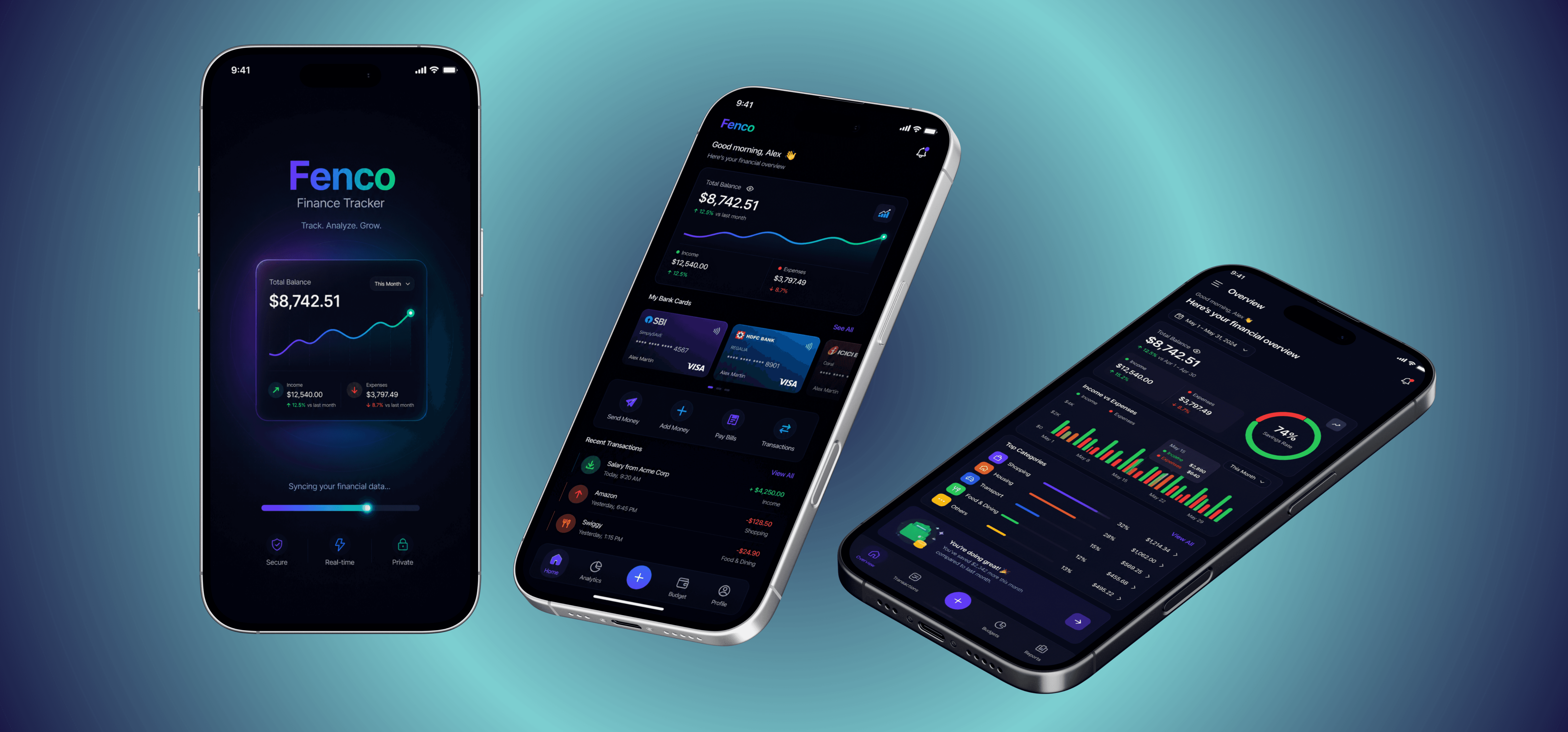
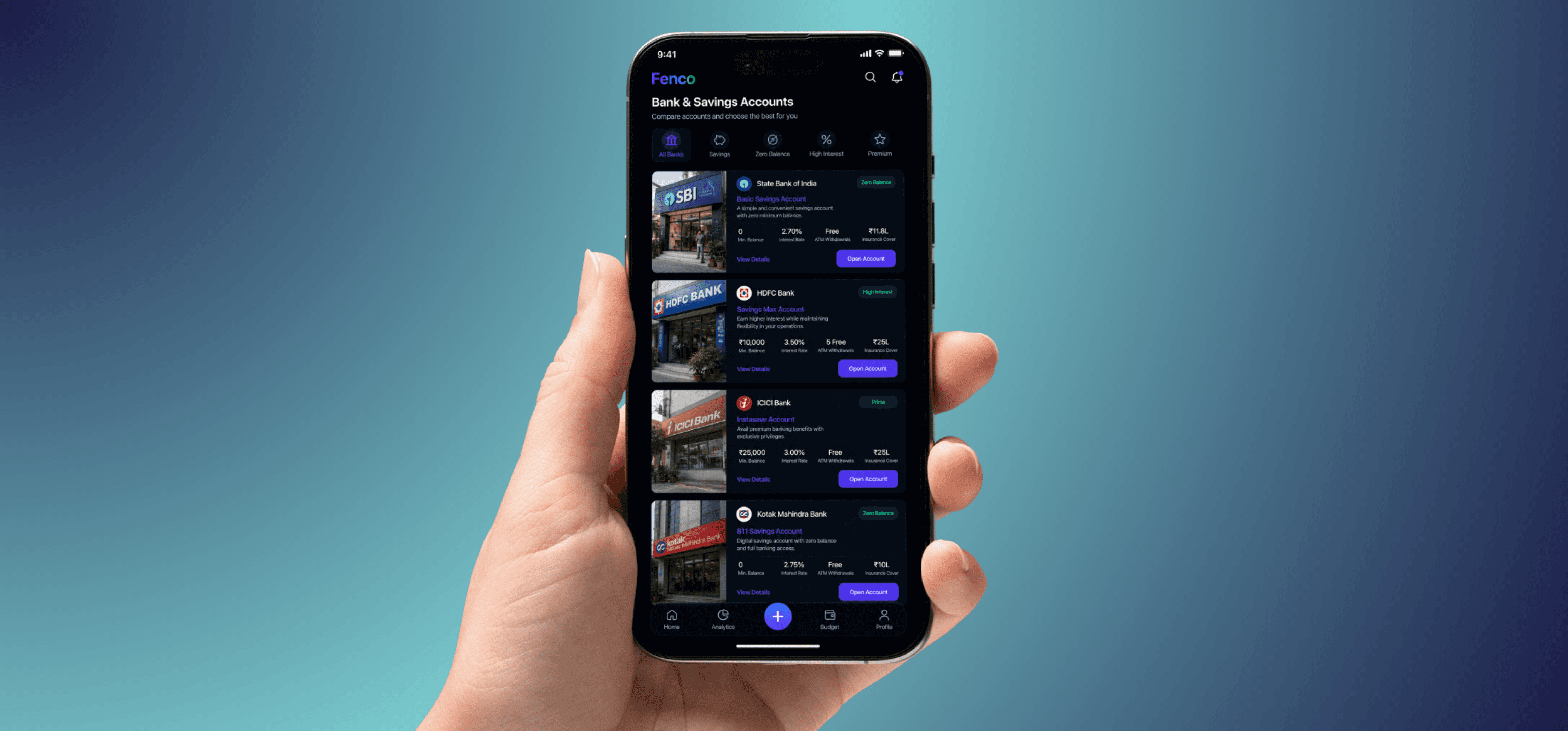
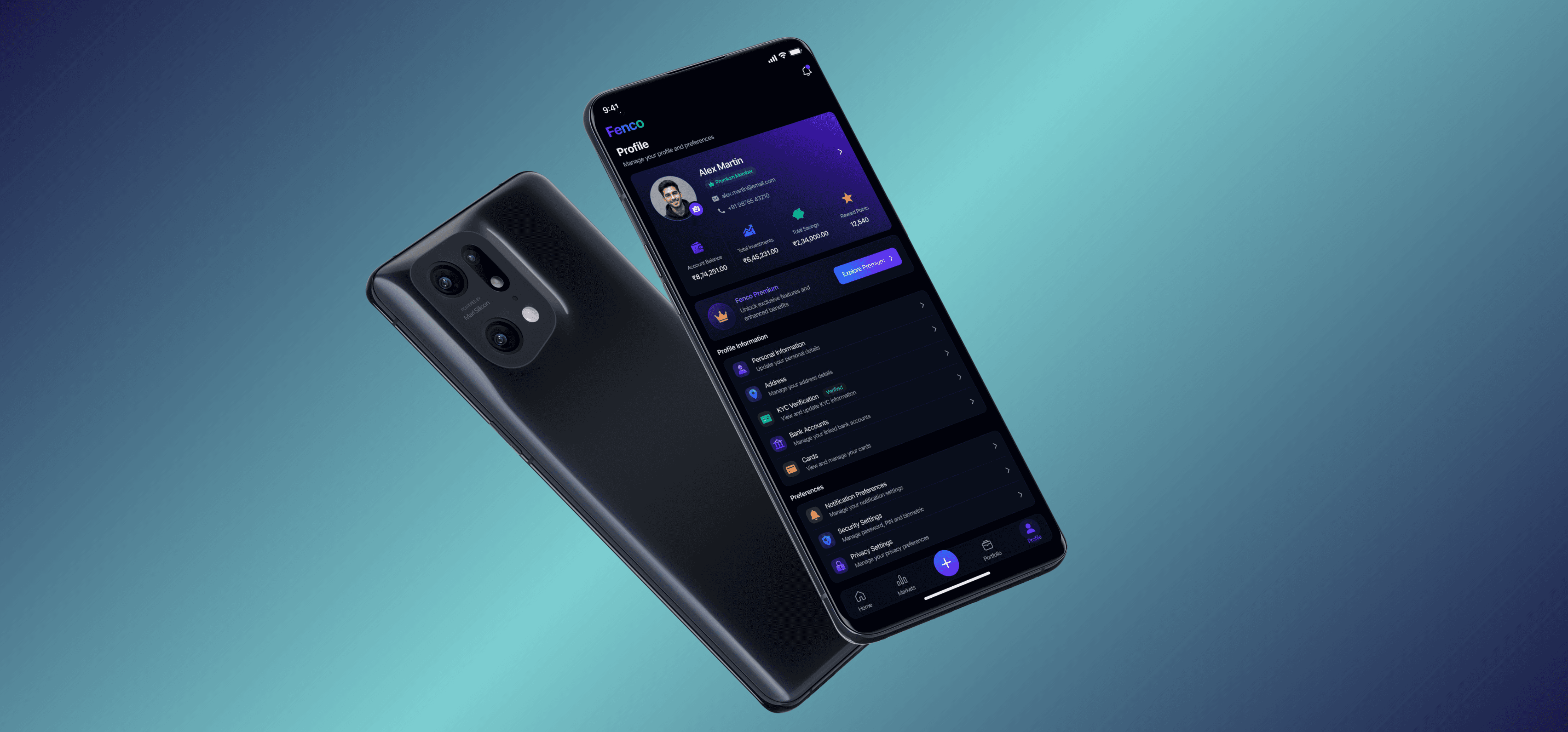
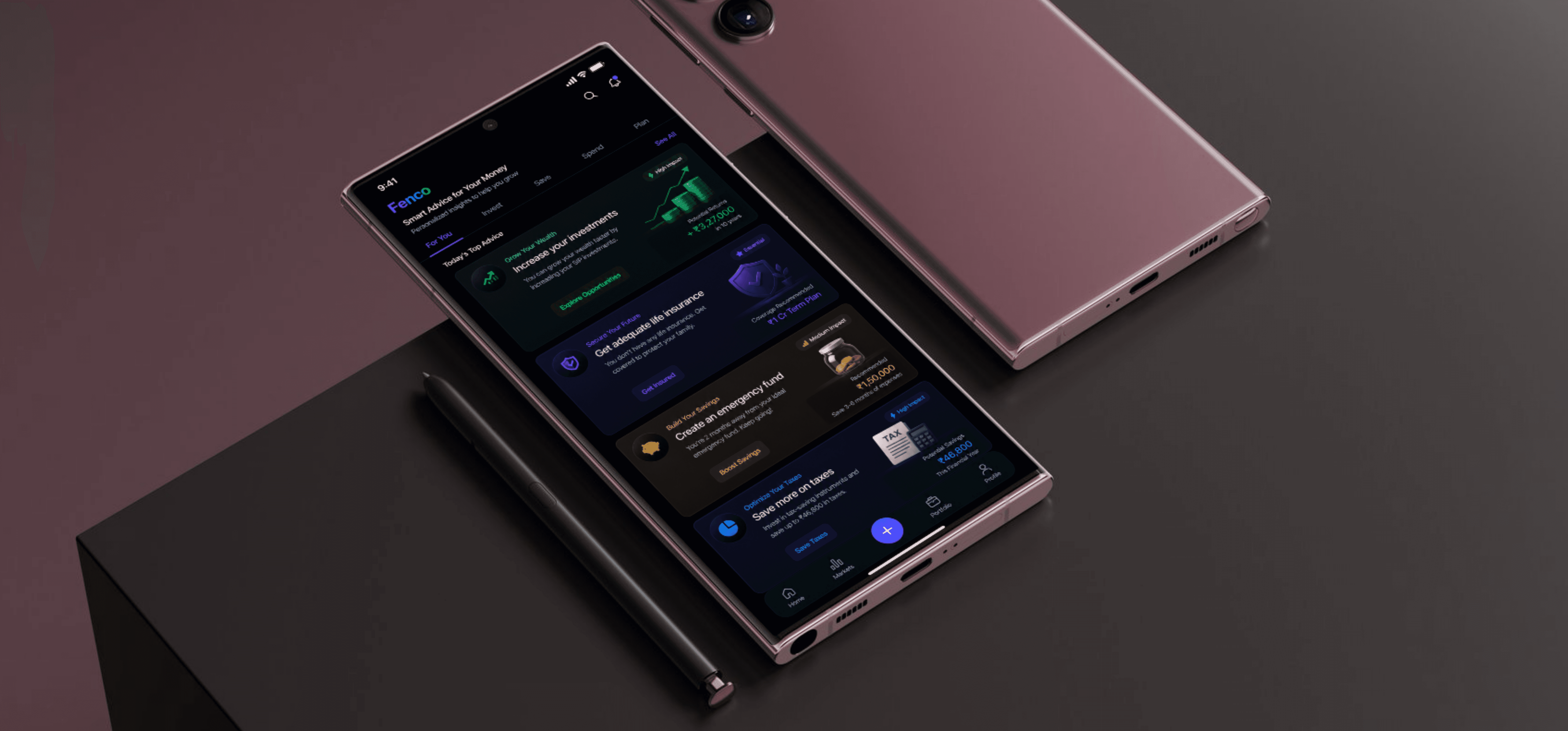
The design of Fenco was imagined as a balance between financial precision and visual calmness — creating an experience that feels sophisticated without becoming overwhelming. The interface embraces a clean futuristic aesthetic with smooth gradients, minimal layouts, refined typography, and interactive analytics designed to make financial management feel intuitive and engaging rather than stressful.
The vision behind Fenco was to reimagine financial tracking as an experience that feels empowering, calming, and intelligently personal. Instead of treating finance as a complex or intimidating task, the redesign aimed to create a digital environment where users could understand their money effortlessly through clean visuals, intuitive interactions, and thoughtfully simplified analytics.
Production & Execution
The design approach for Fenco focused on merging minimal identity systems with functional.
The color palette was kept clean, with neutral bases complemented by sharp accents that highlight key element. The logo system was designed modularly making it flexible for both print and digital applications.
$0+
$0+
Revenue generated
10%
10%
Return on Investment
Final Outcome
Fenco had a strong impact by proving how brand identity and web design could reinforce one another.
Clients appreciated the system’s clarity and adaptability, noting how it translated from stationery to websites.